NEW MEXICO POSTCARD COMPOSITE

POSTCARD TO NOWHERE PROJECT BY GAVIN MANNINO
STEPS
1.The foreground is from a separate image then the mountain range in the background. I used the selection tool and magic wand to add the ground and the cacti and bushes to sell the blend where the two composited photos meet near the lower 1/3 of the image. Not having a straight line helps blend the two into one. For the mountain range, I used the "Lighten" option in the blending mode drop down menu and used the "Divide" option for the foreground of the desert. I really loved the transparent look of the foreground and the "retro" aesthetic that the "Divide" option gave the postcard.
2. Next I added a UFO into the sky layer as a tribute to the famous 1947 Roswell New Mexico "UFO" crash. I used the "Pin Light" option for the blending mode to have the UFO "camouflage" into the background of the sky.
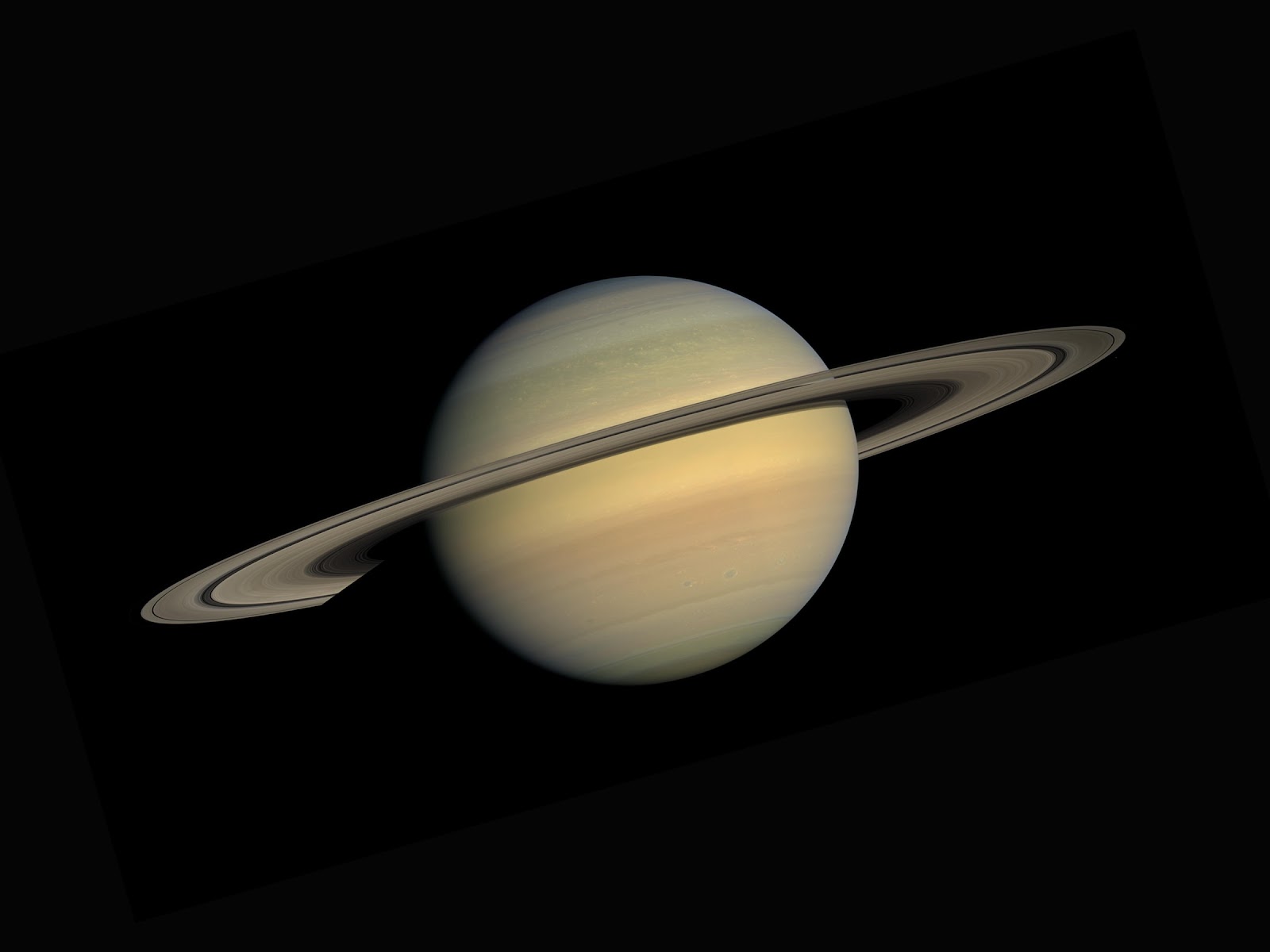
3. I decided to add the moon and Saturn into the top left and top right regions respectively to further the "otherworldly" mood. I used the "Lighten" blend mode option to create the same effect of blending in as the UFO, then I used "Soft Light" for Saturn also for the same effect. The "Tie-dye" sky and the faded graphics in the composited sky reminds me of the classic, rock-and-roll, psychedelic, band t-shirts.
4. After adding all these things, the image felt very top-heavy and unbalanced. I knew I needed to add something to the bottom 1/3 of the image. I originally planned on adding a camper next to his tent looking up at the UFO but I couldn't find the right images to match the on-going aesthetic so I decided on the alien. I wanted the alien to also blend into the background so it was not as noticeable as the UFO, so I used the "Color Dodge" blend option and was pleasantly surprised at the result.
5. After compositing all the images, I adjusted the hue/saturation and the brightness/contrast levels for all the images.
6. Finally, I added in the text and used the "Herculanum" font for both lines. Each line has duplicated text to give the illusion of depth, using a brighter color on the top layer and a darker color on the bottom text layer that is positioned slightly to the left. I used the "Darken" blend option for the top layer of the "Greetings From" line and then for the bottom text layer I used "Darker Color". For the "New Mexico" line, I used the "Lighten Color" blend option on the top layer and then the "Darker Color" blend option on the bottom text layer.
From being unsure of what my project was going to be, I was very happy with the end result. As I made progress with the project, using photoshop became easier and easier. I hope this step-by-step was helpful and informative.


Comments
Post a Comment